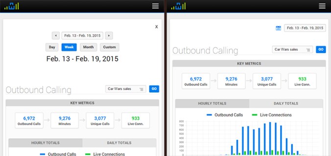
Last summer, I added a fancy date picker to the top of all of CI’s major reports. This date picker included buttons to quickly access data for a variety of date ranges. This feature enhanced the usability of our software, but we recently realized a problem – the date picker was taking up too much vertical space on the top of the page, pushing each report’s meaningful data down and out of view when the page loads. To remedy this problem, we have collapsed the date picker behind an expandable button – which bumps up the meat of the report upwards a good 150 pixels when the page loads.
This was a quick change that was really just a solution to a longstanding (and rational) complaint from our CEO about the date picker being too big. But before making this change, I wanted to track the impact the change would have on our users, so I built an analytics script that tracked how often each button was being clicked within the date picker on a report-by-report basis.
After a week of data collection, I noticed a very curious trend. Of the thirty or so unique reports that we have across our various platforms, nearly 80% of all report views were for the Outbound Activity report. The Outbound Activity report is a useful report, but is certainly not one of our flagship reports.
Even more interesting, of the people who accessed the Outbound Activity report, 65% clicked the “Day” button on the date picker (which shows yesterday’s data), and 82% clicked the “Next Range” button.
I was at baffled by this data. Why are our users so obsessed with the Outbound Activity report? Why are they clicking the “Day” and “Next Range” buttons so often?
After a discussion with one of our consultants, the answer became blindingly obvious. The vast majority of our users use this Outbound Activity report to monitor their live outbound calling activity on a per-staff member basis, ensuring that everyone is meeting their daily OB call quotas.
Not having known this, we still had the default date range for this Outbound Activity report set to the previous week. Thus, our users were (apparently every hour or so) having to load the OB report, then click “Day” to load yesterday’s data, then click “Next Range” to load today’s data. Convoluted by the fact that the date picker was about to be collapsed behind a button, I realized that the process for accessing live outbound call data in our product was not at all easy. In fact, it really sucked.
Solving this problem was as simple as adjusting the OB Activity report’s date range to default to today’s date. The real challenge in the scenario was identifying that there was a problem in the first place, and this would never have happened had I not built an analytics script to gather data on our users’ behavior.
This experiment has undoubtedly inspired me to integrate user data collection into future design decisions. Improving usability always starts with understanding the user, and I look forward to using data collection to supplement my own intuition in my journey to get inside the minds of our users.

