We know everything you’re doing, and when you’re doing it…

A few months ago, I wrote about an experiment I conducted where I tracked how often our users were clicking on the date picker buttons in our reporting platform.  The results to this experiment were so profound that they led to a significant change in our product.  Since then, I have become fascinated with the idea of tracking usage statistics within our products.

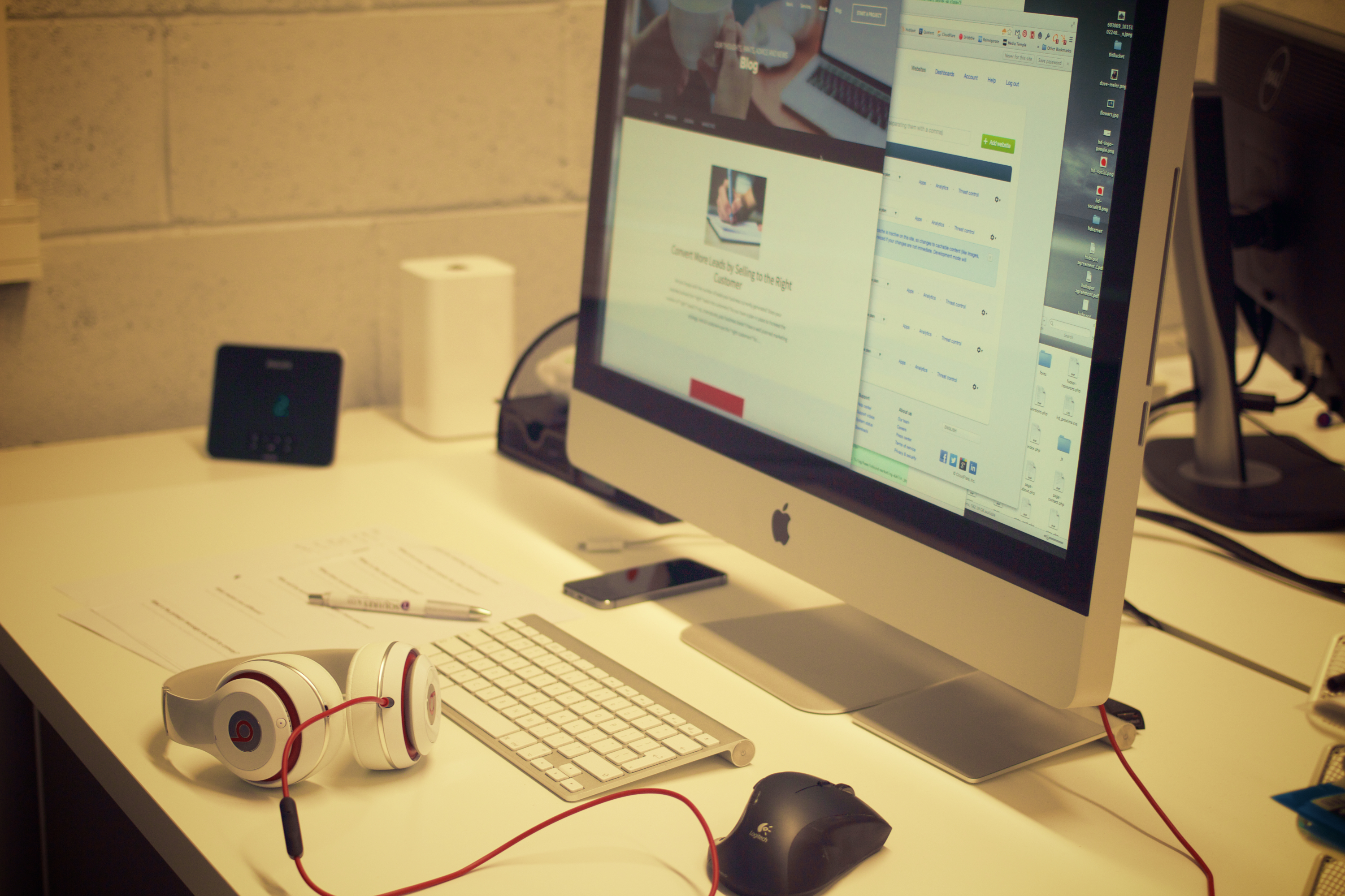
Over the past two months, I have built a full-featured product analytics tool that tracks every single thing that a user is doing when logged in to our platform, when they are doing it, and even how long it takes them to do it.  Here is a screenshot of what that data looks like on our end:

pa-activity

As you can see that this data is organized onto a timeline where the date range can be adjusted.  There are four categories, each of which is expandable. These categories are Configuration, Lead Box, Reports, and General.  In the screenshot, you can see that I have expanded the Configuration category, so that I can view when users in this account have set up automated reports, tracking lines, staff, and users.  I have also expanded the Reports category, so that I can view when users are actively viewing each specific report, and for how long.  If the user’s mouse stops moving for two minutes, we stop tracking data until their mouse moves again.  If I want to view data for a single specific user, I can select an individual user from the dropdown in the top right.  Lastly, I can hover over each data point for more detailed information.

All of this new data will be critical in shaping the future of our product development, as well as the manner in which our consultants train our users to use our products.

To take things a step further, we recognized that there are certain one-time events and actions that are critical to the progression of each user’s understanding of our product.  By tracking these events, we can identify the next steps required to ensure that each user is getting the maximum value out of our product.  Here is an example of what that data looks like on our end:

pa-events

You can see that there are four types of events – Critical Events, Secondary Events, AC Events, and Support Cases.  There are only about six Critical Events in total, and these events are the steps required for a brand new user to get to the WOW moment within our product (the moment that they realize how awesome and valuable our product is).  You can see in the screenshot that I am hovering over the second Critical Event – “provisioned first line”.  Behind Critical Events are Secondary Events.  There are many more Secondary Events than Critical Events, and while these are important, they aren’t quite as urgent for our consultants’ attention.  And that brings me to AC Events.  Our Associate Consultants (ACs) spend most of their time reaching out to our clients, training on our products and ensuring that each customer is receiving maximum value.  And lastly, we log when a support case has been created in association with this account.

Altogether, this event timeline paints a great picture of the lifespan and progression of every single one of our clients.  You can be sure that in the coming months, there will be some great changes coming to our product as a result of this new data that we have just begin tracking.


Design Inspiration

This post is simply going to be a collection of some places that I go for Design inspiration. As a designer for mobile and web, sometimes its hard to come up with original work that also adheres to best practices. It’s a fine line that we have to walk. On the one hand there is a ton of user research that will tell you the best placement for information and UI elements and even the best colors to use. And on the other hand you want to create something original and new, or at the very least express yourself in some way.

These are thetop 3 sites that I turn to for inspiration. But rather than just list them, I’m going to explain why I like these sites specifically over the many other options out there.

Dribbble

I know this site is probably already on every designers favourite list. I just cant get away from this website, it is an amazing collection of all types of design work from mobile UI to flyers. If this website isn’t on your list – it needs to be. SICK – that’s the only way to describe what Dribbble has created.

Chrome Experiments

At first glance you are probably thinking ‘WebGL and Facial Recognition for inspiration?’. The answer is – yes, this site has some of the smartest people pushing the boundaries. Chrome Experiments is really great because it showcases hardware accelerated graphics that use nothing other than the Chrome browser. The main reason I like this site is because it shows me just how powerful the browser is – the browser that we design for daily.

We can do some amazing things with HTML/CSS/Javascript and it is easy to get stuck in the swing of mundane, simple, and basic. I like to push myself to really think – ‘What can I do that is difficult, cutting edge? How can I push the limits of my own work with the latest CSS3 tech or Javascript?’.

Designspiration

At first I didn’t really like this site. It reminds me of Pinterest and I hate Pinterest. While you might be a fan of the popular pin board – infinite scroll bombardment of death – I’m not super fond of mindless scrolling. What I found that I like about this site is that there is a lot of artwork and design work that is in completely different design fields. Architecture, fashion, sculpture, image manipulation, there is a wealth of really cool stuff here.

I am a big fan of looking to other fields for inspiration. After all, a well designed website is a bit like a beautifully designed building or a perfectly decorated living room, when you see it you just know ‘wow, this is amazing’.

The Front End Developer/Designer/UI/UX Guy

creatives-deskIn a perfect world it works a bit like this: Some idea for a product is born, yay!

A user experience guy spends hours and hours researching current/potential users, their history, patterns, likes, dislikes, what flavor of kool-aid they drink, how often they go to the bathroom, etc. Then this guy works with a designer to come up with a beautiful solution. Next, the designer works with a front end developer to write the code to get the new products user interface built. Sometimes an SEO dude will also come in and do his thing (if the product is a website).

After some back and forth, there it is: a masterfully crafted piece of art that solves the bane of someones existence, or allows them to check email faster. Whatever the product, at this point it is ready to be handed off to other developers who hook it up with real data.

Wait a minute, I do all of that. Everything you just described is all me. Whats going on here? Am I being bamboozled? Yes my friend. Yes you are. But, it’s ok! This is the place where many designers and front end developers are finding themselves. Being responsible for so much can be daunting. It might not be the best for a product or a company but for you the person, finding yourself in this position is awesome!

yesss-meme

Front End Developers are sometimes responsible for the users experience, designing the user interface, and building out that experience. That is a lot of pressure. Fortunately, it is also a great opportunity to build out your skill set and open some doors.

There are hundreds of job listings that use the terms ‘Front End Developer’, ‘UI Designer’, or ‘Web Designer’. They all have different criteria based on that companies specific needs – or their interpretation of the job title. Sometimes you will be the designer and developer, sometimes you will just be a designer who does some research, other times you will not design at all, “just write the code you code monkey!”. The point here is that there is opportunity to master a lot of different skills and chase after the one you enjoy the most. Becoming good at user experience, user interface design, web design, seo, front end, etc. will allow you to be a very flexible and desirable professional.

I know what some UX experts and position purists out there will tell you. “This will only hurt the product and the user and there’s no way one person could master all of these things or do them all in one job.” And they are correct. There is no way to completely master each one of these and be the best of the best in everything. You can, however, become very good at them all and learn to use the right tool at the right time and make a positive impact.

To all my fellow Front End/Designer/UI/UX professionals out there who juggle multiple skills. You are not alone and you are becoming valuable!

Usability: Designing with Data

Last summer, I added a fancy date picker to the top of all of CI’s major reports. This date picker included buttons to quickly access data for a variety of date ranges. This feature enhanced the usability of our software, but we recently realized a problem – the date picker was taking up too much vertical space on the top of the page, pushing each report’s meaningful data down and out of view when the page loads. To remedy this problem, we have collapsed the date picker behind an expandable button – which bumps up the meat of the report upwards a good 150 pixels when the page loads.

date_picker

This was a quick change that was really just a solution to a longstanding (and rational) complaint from our CEO about the date picker being too big. But before making this change, I wanted to track the impact the change would have on our users, so I built an analytics script that tracked how often each button was being clicked within the date picker on a report-by-report basis.

After a week of data collection, I noticed a very curious trend. Of the thirty or so unique reports that we have across our various platforms, nearly 80% of all report views were for the Outbound Activity report. The Outbound Activity report is a useful report, but is certainly not one of our flagship reports.

Even more interesting, of the people who accessed the Outbound Activity report, 65% clicked the “Day” button on the date picker (which shows yesterday’s data), and 82% clicked the “Next Range” button.

I was at baffled by this data. Why are our users so obsessed with the Outbound Activity report? Why are they clicking the “Day” and “Next Range” buttons so often?

After a discussion with one of our consultants, the answer became blindingly obvious. The vast majority of our users use this Outbound Activity report to monitor their live outbound calling activity on a per-staff member basis, ensuring that everyone is meeting their daily OB call quotas.

Not having known this, we still had the default date range for this Outbound Activity report set to the previous week. Thus, our users were (apparently every hour or so) having to load the OB report, then click “Day” to load yesterday’s data, then click “Next Range” to load today’s data. Convoluted by the fact that the date picker was about to be collapsed behind a button, I realized that the process for accessing live outbound call data in our product was not at all easy. In fact, it really sucked.

Solving this problem was as simple as adjusting the OB Activity report’s date range to default to today’s date. The real challenge in the scenario was identifying that there was a problem in the first place, and this would never have happened had I not built an analytics script to gather data on our users’ behavior.

This experiment has undoubtedly inspired me to integrate user data collection into future design decisions. Improving usability always starts with understanding the user, and I look forward to using data collection to supplement my own intuition in my journey to get inside the minds of our users.

Functional. Reliable. Usable. Delightful.

Aarron Walter, MailChimp’s user experience design lead, has developed an insightful model for what goes in to creating great software. Clearly a reskinning of the famed Maslow’s hierarchy of needs, Walter’s pyramid (as seen below) is a representation of the four basic user needs that must be considered when building software.

pyramid

During my architectural studies at Texas A&M, we didn’t spend much time discussing pyramid construction, but I’m fairly sure that if the lower tiers are weak, the top tiers will crumble. That said, here is a quick breakdown of Walter’s model:

  1. Functional – Above all, software has to actually function. A button titled “Outbound Activity” must actually load a report that displays outbound calling data.
  2. Reliable – A user needs to know that the outbound calling data they are viewing is accurate and secure data.
  3. Usable – This data must be organized to be quickly accessible and easy to understand.
  4. Delightful – This is the key piece that Walter focuses on, and the piece that sets MailChimp apart from its competitors. Delightful software must appeal to the user on an emotional level, and produce an insightful and memorable experience.

Different members of Century Interactive’s dev team focus on different tiers of this pyramid within our products, and so I am going to kick of a short mini-series written by our different team members, focusing on how we strive to improve our functionality, reliability, usability, and delightfulness.

Here are the links to the posts for each topic:

A Better Way to Add Users

Recently, we introduced a new method for adding new users. The primary purpose? To make it quicker and easier for admin users to add new users to the platform.

New user  4

We’ve taken the burden of creating new users off of the administrator or manager, and instead simplified the process so that the new user can set up their own account. Simply enter the email addresses of all new users, and we’ll send a set up link to their inbox. From there, set up couldn’t be simpler. The new user will set up their username and password, associate their username with a phone code, and even configure their Lead Box.

The User tool (mx_users) now syncs with the Staff tool (mx_phonecode) to allow a staff member and their phone code data to be associated with a username for the platform. This allows for a couple of  things: for staff members to log into the platform and see phone skills data directly related to their calls and to allow us to reach out directly to staff members via email or phone number to help them improve their phone skills.

User Set up  4


Design of the mx_users was rethought as well. Because we may be working with users that have never seen our product before, but just got an email to create their profile, we knew we wanted the design to be as simple as possible. Our design team changed the tool to use a walk-through format to guide the new user through setup one step at a time.

It’s also important that new users finish their user setup and don’t abandon it in the middle of the process, so we included a progress bar to encourage the new user to complete setup. This Kissmetrics article describes how that progress bar psychologically persuades people to finish the task at hand and the closure they feel when the bar is 100% complete.

To see firsthand how we’ve improved the Users tool, click User Logins from your dashboard.


User Experience: How we put our users first

Imagine two scenarios. In the one, you are using a brand new app on your smart phone to help you order a sweet bacon pizza. You open the app and find no instructions. There is just a list of options, none of which make sense! You are eventually able to order your pizza, but are not quite sure where its coming from, or how to pay. The experience is awful (And you REALLY want your bacon pizza)! In the other, using a different app, you are walked through your pizza creation process, put in touch with a local pizza business(organic even! you like that!), had your payment taken, and even received a 15 minute delivery guarantee message. How about that? Hot dog! Or since were talking about pizza, Hot pizza!

Pizza is a serious, delicious subject indeed, but I am going to be talking about something monumentally important to almost any and every business/product that exists. User Experience. Before you rush on reading the rest of this oven baked, hand-tossed article, stop and think about it. User. Experience. Our lives are dictated by our experiences, we can be up or down, happy or sad, down or out on a moments notice because of one experience! An experience will excite us to the brim of fantastical explosion! -or- It will drag us down into the dumpy doldrums of mediocre, flat, boring every day life (Yuck).

Here at Century Interactive(CI) our design team is always thinking about the user because we like our users and want to delight them *gasp*. I know, its crazy, I’ll explain. We think of our users from product conception at a high level all the way through to that one tiny line of text at the bottom of a page. In order to create a user experience that really delivers boatloads of pepperoni – I mean – delightfulness, you have got to think big and think small. You have to think about the entire system on a high level in order to create an experience. You also have to think small – the tiniest detail can throw the whole thing off. Think about the last time you tried to find a contact number on a company website and you spent 10 minutes digging around for one. One small thing can send users running to the hills of delightfulness that exist somewhere besides your company!

An experience will excite us to the brim of fantastical explosion! -or- It will drag us down into the dumpy doldrums of mediocre, flat, boring every day life (Yuck).

In our pursuit of creating a delightful user experience we have had to develop and cultivate empathy for our users. We put ourselves in our users shoes and evaluate everything. Every detail and feature needs to be put in the brick oven and toasted – tested. Will it be beneficial to the user or will it hinder them? How does this specific feature help the user, and when do we present it to them as an option? We might not be making them a mouth-watering, tummy-satisfying pizza, but we are creating a delightful user experience for them (because we love them)!

So how did we apply these concepts to a practical project here at CI? In our newest product, Service Hook, we put the user first at every stage of design and development. Our design team was brought in at the very beginning when Service Hook was an idea on a post-it. We brainstormed about how to get users on the product – freemium. We removed all barriers that would hinder the user from signing up – that’s not a novel thing, but it was a very important decision for us as a company. Next, we looked at hundreds of ways other companies and products “onboard” their users, then we designed our own process. We get the user, in three steps, from sign up to being smack in the middle of Service Hook.

Great, they are in the product, now what? More brainstorming. How do we get the user oriented quickly and functionally productive in our product? Our solution was to design a help wizard, yes we used a literal wizard (Gandalf would be proud!), to walk the user through a few basic things. We didn’t just stop here though, our thinking of the users experience cant end right now. We watch what they do and how often they use features, then we reach out to them to ensure they are having an amazing experience. We have a consultant team that welcomes them, provides suggestions on how to grow their business, and shows them how to really utilize Service Hook. Do we stop here? No. Because our users journey is still not over. They are our users for life.

One small thing can send users running to the hills of delightfulness that exist somewhere besides your company!

Thinking big picture about the entire user experience in the beginning enabled us to better design the details. We are able to tie in details (like buttons, text, and even the website) to the look and feel of the overall experience. Our aim was and will remain high – to delight our users with a great experience. Now go forth, and order that bacon pizza!