Instruments for the Occasion

Chances are, if you’ve ever been to a college football game, you’ve heard the drum-line. The loud crashes of cymbals, tight tap of the snares, deep tones of the bass drums, you get the idea. In order to get these specific sounds, different tools are used. Quads use special mallets, as does the pit according to whatever instrument is being played. You wouldn’t use brushes on a snare drum just as you wouldn’t use bass beaters on a xylophone.

Percussion_Beaters

Writing Microsoft SQL queries is the same way. Just as specified mallets and sticks are used in drum-line, different SQL techniques are used depending on the situation.


select refname, lskinid, round(sum(leminutes), 2) as 'Minutes' from lskin
	join hproduct_lskin on frn_lskinid = lskinid
	join dnis on add_lskinid = frn_lskinid
	join archive.dbo.xcall_2014 on cf_frn_dnisid = dnisid
		and tz_date between '2014-01-01' and '2014-03-01'
where frn_hproductid = 1
group by refname, lskinidRegular_time

Above is just a basic query; nothing special, just some joins. As you can see, it took 1 minute and 58 seconds to complete.

with CTE (refname, lskinid, dnisid)
as (
select refname, lskinid, dnisid from lskin
	join hproduct_lskin on frn_lskinid = lskinid
	join dnis on add_lskinid = frn_lskinid
where frn_hproductid = 1
)
select refname, lskinid, round(sum(leminutes), 2) as 'Minutes' 
from CTE c
	join archive.dbo.xcall_2014 on cf_frn_dnisid = c.dnisid
		and tz_date between '2014-01-01' and '2014-03-01'
group by refname, lskinidCTE_time

This takes the same query and separates it into 2 parts using a CTE. Changing the technique cut the time down to only 8 seconds.

declare @TempTable table (refname varchar(155), lskinid int, dnisid int)

insert into @TempTable (refname,lskinid, dnisid)
(
select refname, lskinid, dnisid from lskin
	join hproduct_lskin on frn_lskinid = lskinid
	join dnis on add_lskinid = frn_lskinid
where frn_hproductid = 1
)
select refname, lskinid, round(sum(leminutes), 2) as 'Minutes' 
from @TempTable t
	join archive.dbo.xcall_2014 on cf_frn_dnisid = t.dnisid
		and tz_date between '2014-01-01' and '2014-03-01'
group by refname, lskinidTempTable_time

Again, just a different technique (using a Temp Table) cut the query down to 8 seconds.


Those are just a few examples of query techniques in SQL. So next time you have to write a query, make sure you’re using the right ‘instrument’ for the occasion.

Functionality: Keeping Your Users Happy

Picture this: You receive a text message saying that your bank account is overdrawn and you are in the middle of procuring your life’s necessities (also known as grocery shopping). You know you have money in your savings, so you’ll just transfer $200.00 until your next payday. So you pull up your bank’s app/website and enter your username and password on the log in screen and press enter, nothing happens. How do you feel? Most likely a bit ticked off that you can’t access your hard earned money, correct?

Here is where a website’s functionality comes into play. The design of the website/report can make is rain silver and gold, but if you click a button that is supposed to log you in or load up another date on a report, the design of the website means nothing to you as a user. As a back end developer it is my job to make sure that every time you click, drag, or drop that the information you need is accessible and loads as quickly as humanely possible. To keep our users happy and smiling, I implement a functionality goal list in all of my programming projects:

  1.  When a user creates an event on a page:
    1. Does it load correctly?
    2. Does it load quickly?
    3. Does it display the correct information?
  2. If a page is to error out:
    1. Does it display a message that says we will quickly fix this issue?
    2. Does it display any coding that a user can use to hack our system?
  3. Does it load correctly on all devices? (Meaning no cut off words, etc.)
    1. Computer?
    2. Mobile Phone?
    3. Tablet?
  4. Can something be done to speed up the final queries just a little bit more?
  5. Can (2-3) users other than myself confirm that all of this works correctly as well?

If you can confirm that all of these actions pass your expectations, you will have a functional website or report on your hands.

Want to see this list in action? Check out any of our reporting pods in Car Wars, Service Setter, or any of our other platforms!

Reliability: Creating Rock-Solid Software

What makes great software great? Does it have to look good? Does it have to have a great user interface? While those things are good and will make your application pleasant, those things alone won’t make software great. Software must work, it must work without errors, and it must work every time you try and use it. Some would say that the most important aspect of software is its reliability. If an application doesn’t work, pretty visuals and user interfaces are all for nothing.

So how do we make software reliable? Reliability goes hand-in-hand with functionality, so before you even start, you must decide what the software will do and have a basic plan of how it will accomplish its task. You might even create a barebones application as a proof-of-concept to ensure your methods will work and be a solid foundation to work off of. This initial prototype will actually help in squashing initial bugs and issues that could show up later in the process.

Once you know how you want to proceed and know that it will work, you begin building your application. First and foremost, you want it to function (obviously), but once you get it to function, it must be reliable. Your customers will begin to rely on this software, so it has to work fast and it has to work every time they access it. Working every time is more important than raw speed, so we’ll start there.

Software that doesn’t work is frustrating, but what’s more frustrating is software that works most of the time, but fails you when you most need it. To ensure your application will work each and every time you need it to, you must test it, test it, and test it. Test it until it works without fail, then test it again. Play the malicious user and try to break it. You wrote the code, you know where the vulnerabilities are; exploit those vulnerabilities and learn how to plug those holes. If your app uses forms for user input, validate those inputs, first on the user interface, and again within processing.

Make sure that nothing you can do will send the application into an unusable state. Even when you are sure that there is no way that your code can be broken, add in error handling. In the case that somehow you didn’t consider all possible scenarios that could lead to an error, you must have a way to gracefully handle these rare exceptions. Handling errors can be as simple as a generic message asking the user to please try again, to the most sophisticated algorithms that predict what the user was trying to do.

Once the application works without failure, you must ensure that it runs efficiently. If it feels slow and sluggish, this will be a source of frustration for your users.  With modern programming languages, efficiency of your code base isn’t as much of a concern as it once was, but you should still strive to be as efficient as possible. Simple is usually better. You shouldn’t create some off-the-wall, complicated function to do a task that can be quickly and easily accomplished by a method built in to your language or provided in a library. In most instances, it’s a waste of time. Also, anyone who comes behind you and tries to update your code or do maintenance will need to take time to figure out what the application is doing there.

If you are pulling data from a database, then the efficiency of your database is very important in the speed of your application. Not only do the tables need the appropriate indexes and keys, but the way in which you query the information must also be efficient. Simple and quick queries are best. Get in, get the information you need, and get out so that your application doesn’t tie up valuable resources on you database server. Any complicated calculations should be handled in the application layer, not the database. You should do simple aggregates (count, sum, etc.) within the database, then hand those off to the application to do the bulk of the data processing.

Just because these steps are taken, it doesn’t mean you are finished. Software can always be improved, and as developers we should strive to always be improving.  These also aren’t the only steps to take in making your software rock-solid, there are countless other aspects in which you can improve your application. These two, speed and reliability, are great building blocks to start with, though.

The Car and Engine of the Numbers

Before I go over the engine, I’m going to explain the other parts so that you have an idea of what our engine powers. So when you look at a car the first thing that you see is the paint, rims and accents of the car. This is the wonderful product of our design team. They ensure that our users have the Ultimate user experience by designing things with the user in mind. Next is the inside of the car, all the bells and whistles! This consist of our queries and ColdFusion coding that are not really outward facing. This part is the product of a variety of teams. All of these ensure the reports, processes and data gathering are done properly. Humanatic would be the person driving the car. You don’t get from point A to point B without driving. All of our call reviews go through a system maintained by a small amount of people. The maintenance of the car is important here as well. Here our Cases team goes through anything that is going wrong and meticulously hunts it down and fixes the bells and whistles. This is the heart of the Hacker Farm. I say this because it is not the most glamorous job, but it allows people to focus on other issues and not to be pulled in a thousand directions. Now that you have an idea of the process, to the Engine. This is the part of the car that no one ever sees. Most people never see the engine or know all it does but expect it to work none the less. One last important team is the Projects team, which is in essence is our GPS. You, know Google maps because they keep us on the right path. They tell us the projects to do and keep them in flow
The engine of all of our reports, queries, processes and even our data gathering all comes from our hardware. This gets broken down into our servers, dialtag boxes, email systems, databases, system updates to name a few of the engine components. The integrity of the databases are an extremely important task that is done. Since we don’t have a DBA it comes down to the team leads and the Systems team to ensure that they are running smoothly. Our servers are monitored highly. It would be like have a thousand sensors in your engine telling you exactly what is going wrong. We get emails and have systems set up that tell us the load of the server, if and when it went down, the loads that it has had over a period of time. Even our email systems are monitored for anything that could pop up. High email flow, services that crash and block reports being sent out. Our server have hard drive failures, system updates and configurations that all have to be taken care of. The way a lot of systems are set up are that they have redundant drives to hold the system up until we can replace the drive.

Usability: Designing with Data

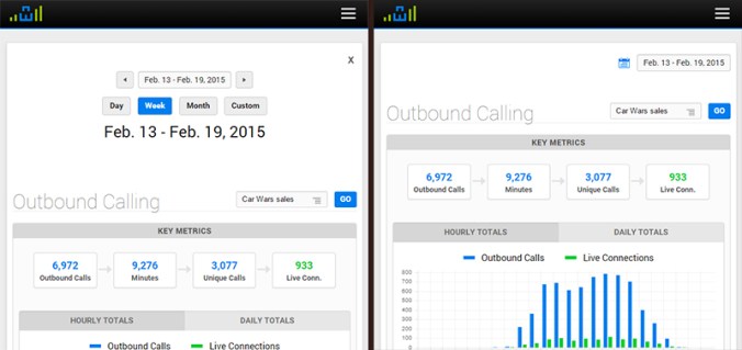
Last summer, I added a fancy date picker to the top of all of CI’s major reports. This date picker included buttons to quickly access data for a variety of date ranges. This feature enhanced the usability of our software, but we recently realized a problem – the date picker was taking up too much vertical space on the top of the page, pushing each report’s meaningful data down and out of view when the page loads. To remedy this problem, we have collapsed the date picker behind an expandable button – which bumps up the meat of the report upwards a good 150 pixels when the page loads.

date_picker

This was a quick change that was really just a solution to a longstanding (and rational) complaint from our CEO about the date picker being too big. But before making this change, I wanted to track the impact the change would have on our users, so I built an analytics script that tracked how often each button was being clicked within the date picker on a report-by-report basis.

After a week of data collection, I noticed a very curious trend. Of the thirty or so unique reports that we have across our various platforms, nearly 80% of all report views were for the Outbound Activity report. The Outbound Activity report is a useful report, but is certainly not one of our flagship reports.

Even more interesting, of the people who accessed the Outbound Activity report, 65% clicked the “Day” button on the date picker (which shows yesterday’s data), and 82% clicked the “Next Range” button.

I was at baffled by this data. Why are our users so obsessed with the Outbound Activity report? Why are they clicking the “Day” and “Next Range” buttons so often?

After a discussion with one of our consultants, the answer became blindingly obvious. The vast majority of our users use this Outbound Activity report to monitor their live outbound calling activity on a per-staff member basis, ensuring that everyone is meeting their daily OB call quotas.

Not having known this, we still had the default date range for this Outbound Activity report set to the previous week. Thus, our users were (apparently every hour or so) having to load the OB report, then click “Day” to load yesterday’s data, then click “Next Range” to load today’s data. Convoluted by the fact that the date picker was about to be collapsed behind a button, I realized that the process for accessing live outbound call data in our product was not at all easy. In fact, it really sucked.

Solving this problem was as simple as adjusting the OB Activity report’s date range to default to today’s date. The real challenge in the scenario was identifying that there was a problem in the first place, and this would never have happened had I not built an analytics script to gather data on our users’ behavior.

This experiment has undoubtedly inspired me to integrate user data collection into future design decisions. Improving usability always starts with understanding the user, and I look forward to using data collection to supplement my own intuition in my journey to get inside the minds of our users.

A Better Way to Add Users

Recently, we introduced a new method for adding new users. The primary purpose? To make it quicker and easier for admin users to add new users to the platform.

New user  4

We’ve taken the burden of creating new users off of the administrator or manager, and instead simplified the process so that the new user can set up their own account. Simply enter the email addresses of all new users, and we’ll send a set up link to their inbox. From there, set up couldn’t be simpler. The new user will set up their username and password, associate their username with a phone code, and even configure their Lead Box.

The User tool (mx_users) now syncs with the Staff tool (mx_phonecode) to allow a staff member and their phone code data to be associated with a username for the platform. This allows for a couple of  things: for staff members to log into the platform and see phone skills data directly related to their calls and to allow us to reach out directly to staff members via email or phone number to help them improve their phone skills.

User Set up  4


Design of the mx_users was rethought as well. Because we may be working with users that have never seen our product before, but just got an email to create their profile, we knew we wanted the design to be as simple as possible. Our design team changed the tool to use a walk-through format to guide the new user through setup one step at a time.

It’s also important that new users finish their user setup and don’t abandon it in the middle of the process, so we included a progress bar to encourage the new user to complete setup. This Kissmetrics article describes how that progress bar psychologically persuades people to finish the task at hand and the closure they feel when the bar is 100% complete.

To see firsthand how we’ve improved the Users tool, click User Logins from your dashboard.


User Experience: How we put our users first

Imagine two scenarios. In the one, you are using a brand new app on your smart phone to help you order a sweet bacon pizza. You open the app and find no instructions. There is just a list of options, none of which make sense! You are eventually able to order your pizza, but are not quite sure where its coming from, or how to pay. The experience is awful (And you REALLY want your bacon pizza)! In the other, using a different app, you are walked through your pizza creation process, put in touch with a local pizza business(organic even! you like that!), had your payment taken, and even received a 15 minute delivery guarantee message. How about that? Hot dog! Or since were talking about pizza, Hot pizza!

Pizza is a serious, delicious subject indeed, but I am going to be talking about something monumentally important to almost any and every business/product that exists. User Experience. Before you rush on reading the rest of this oven baked, hand-tossed article, stop and think about it. User. Experience. Our lives are dictated by our experiences, we can be up or down, happy or sad, down or out on a moments notice because of one experience! An experience will excite us to the brim of fantastical explosion! -or- It will drag us down into the dumpy doldrums of mediocre, flat, boring every day life (Yuck).

Here at Century Interactive(CI) our design team is always thinking about the user because we like our users and want to delight them *gasp*. I know, its crazy, I’ll explain. We think of our users from product conception at a high level all the way through to that one tiny line of text at the bottom of a page. In order to create a user experience that really delivers boatloads of pepperoni – I mean – delightfulness, you have got to think big and think small. You have to think about the entire system on a high level in order to create an experience. You also have to think small – the tiniest detail can throw the whole thing off. Think about the last time you tried to find a contact number on a company website and you spent 10 minutes digging around for one. One small thing can send users running to the hills of delightfulness that exist somewhere besides your company!

An experience will excite us to the brim of fantastical explosion! -or- It will drag us down into the dumpy doldrums of mediocre, flat, boring every day life (Yuck).

In our pursuit of creating a delightful user experience we have had to develop and cultivate empathy for our users. We put ourselves in our users shoes and evaluate everything. Every detail and feature needs to be put in the brick oven and toasted – tested. Will it be beneficial to the user or will it hinder them? How does this specific feature help the user, and when do we present it to them as an option? We might not be making them a mouth-watering, tummy-satisfying pizza, but we are creating a delightful user experience for them (because we love them)!

So how did we apply these concepts to a practical project here at CI? In our newest product, Service Hook, we put the user first at every stage of design and development. Our design team was brought in at the very beginning when Service Hook was an idea on a post-it. We brainstormed about how to get users on the product – freemium. We removed all barriers that would hinder the user from signing up – that’s not a novel thing, but it was a very important decision for us as a company. Next, we looked at hundreds of ways other companies and products “onboard” their users, then we designed our own process. We get the user, in three steps, from sign up to being smack in the middle of Service Hook.

Great, they are in the product, now what? More brainstorming. How do we get the user oriented quickly and functionally productive in our product? Our solution was to design a help wizard, yes we used a literal wizard (Gandalf would be proud!), to walk the user through a few basic things. We didn’t just stop here though, our thinking of the users experience cant end right now. We watch what they do and how often they use features, then we reach out to them to ensure they are having an amazing experience. We have a consultant team that welcomes them, provides suggestions on how to grow their business, and shows them how to really utilize Service Hook. Do we stop here? No. Because our users journey is still not over. They are our users for life.

One small thing can send users running to the hills of delightfulness that exist somewhere besides your company!

Thinking big picture about the entire user experience in the beginning enabled us to better design the details. We are able to tie in details (like buttons, text, and even the website) to the look and feel of the overall experience. Our aim was and will remain high – to delight our users with a great experience. Now go forth, and order that bacon pizza!

Speeding up reports

At Century Interactive, we know presenting data in a clear and useful way is one of the keys to helping our customers understand what it takes to own their phones.  One of our favorite ways to do this is by using detailed graphs that span anywhere from one day to several months.  The advantage of displaying extensive amounts of data is that our customers can quickly identify trends in calling activity and overall business performance.

Sharing this information makes our customers happy, but it can be a major headache for the developers who create the reports.  Five weeks of data for one company usually involves thousands of database rows that have to be combed and neatly organized.  Not only do our customers want to see the extra data, they want it to be available nearly instantaneously.  The task becomes a balance between server capabilities, database storage and overall load times.

According to surveys done by Akamai and Gomez.com, nearly half of web users expect a site to load in 2 seconds or less, and they tend to abandon a site that hasn’t loaded within 3 seconds.  Armed with this information, how do we display all our useful metrics without having users feel frustrated while looking at our beautiful loading .gif? Here are three of our easier solutions:

1.  Cut down the number of “order by” statements in the SQL queries.  Removing one “order by” statement from a SQL query returning 9,000 rows cut execution time from 3,156 milliseconds to 2,078 milliseconds.  That’s over one critical second of time we saved each one of our customers each time they visit that report.

2.  Create aggregate join tables.  By creating new tables that only reference information from other tables, we can cut down execution time to only the rows in the new table.  For example, this is helpful when we only want data from certain customers.  There’s no reason to go through our entire customer base when we only want data from dealerships.  By identifying dealership customers in a separate table, the query can skip thousands of rows on each page load.

3.  Utilize AJAX to make requests behind the scenes.  Incorporating AJAX into our reports not only cuts down on initial load times, it lets users choose what data they want to see.  The beauty of this is that the user gets more options and the amount of information we have to initially load can be cut considerably.  For example, our new CRISP score report shows a line graph with the individual “C”, “R/I”, “S” or “P” score plotted against the top 5 dealership’s over the last five weeks.  Upon page load, the only score that is shown is the “C” or “connect” score.  By adding buttons which let the user pick what score to show, we don’t have to load the other scores until the user decides to look at them.