Design Inspiration

This post is simply going to be a collection of some places that I go for Design inspiration. As a designer for mobile and web, sometimes its hard to come up with original work that also adheres to best practices. It’s a fine line that we have to walk. On the one hand there is a ton of user research that will tell you the best placement for information and UI elements and even the best colors to use. And on the other hand you want to create something original and new, or at the very least express yourself in some way.

These are thetop 3 sites that I turn to for inspiration. But rather than just list them, I’m going to explain why I like these sites specifically over the many other options out there.

Dribbble

I know this site is probably already on every designers favourite list. I just cant get away from this website, it is an amazing collection of all types of design work from mobile UI to flyers. If this website isn’t on your list – it needs to be. SICK – that’s the only way to describe what Dribbble has created.

Chrome Experiments

At first glance you are probably thinking ‘WebGL and Facial Recognition for inspiration?’. The answer is – yes, this site has some of the smartest people pushing the boundaries. Chrome Experiments is really great because it showcases hardware accelerated graphics that use nothing other than the Chrome browser. The main reason I like this site is because it shows me just how powerful the browser is – the browser that we design for daily.

We can do some amazing things with HTML/CSS/Javascript and it is easy to get stuck in the swing of mundane, simple, and basic. I like to push myself to really think – ‘What can I do that is difficult, cutting edge? How can I push the limits of my own work with the latest CSS3 tech or Javascript?’.

Designspiration

At first I didn’t really like this site. It reminds me of Pinterest and I hate Pinterest. While you might be a fan of the popular pin board – infinite scroll bombardment of death – I’m not super fond of mindless scrolling. What I found that I like about this site is that there is a lot of artwork and design work that is in completely different design fields. Architecture, fashion, sculpture, image manipulation, there is a wealth of really cool stuff here.

I am a big fan of looking to other fields for inspiration. After all, a well designed website is a bit like a beautifully designed building or a perfectly decorated living room, when you see it you just know ‘wow, this is amazing’.

The Front End Developer/Designer/UI/UX Guy

creatives-deskIn a perfect world it works a bit like this: Some idea for a product is born, yay!

A user experience guy spends hours and hours researching current/potential users, their history, patterns, likes, dislikes, what flavor of kool-aid they drink, how often they go to the bathroom, etc. Then this guy works with a designer to come up with a beautiful solution. Next, the designer works with a front end developer to write the code to get the new products user interface built. Sometimes an SEO dude will also come in and do his thing (if the product is a website).

After some back and forth, there it is: a masterfully crafted piece of art that solves the bane of someones existence, or allows them to check email faster. Whatever the product, at this point it is ready to be handed off to other developers who hook it up with real data.

Wait a minute, I do all of that. Everything you just described is all me. Whats going on here? Am I being bamboozled? Yes my friend. Yes you are. But, it’s ok! This is the place where many designers and front end developers are finding themselves. Being responsible for so much can be daunting. It might not be the best for a product or a company but for you the person, finding yourself in this position is awesome!

yesss-meme

Front End Developers are sometimes responsible for the users experience, designing the user interface, and building out that experience. That is a lot of pressure. Fortunately, it is also a great opportunity to build out your skill set and open some doors.

There are hundreds of job listings that use the terms ‘Front End Developer’, ‘UI Designer’, or ‘Web Designer’. They all have different criteria based on that companies specific needs – or their interpretation of the job title. Sometimes you will be the designer and developer, sometimes you will just be a designer who does some research, other times you will not design at all, “just write the code you code monkey!”. The point here is that there is opportunity to master a lot of different skills and chase after the one you enjoy the most. Becoming good at user experience, user interface design, web design, seo, front end, etc. will allow you to be a very flexible and desirable professional.

I know what some UX experts and position purists out there will tell you. “This will only hurt the product and the user and there’s no way one person could master all of these things or do them all in one job.” And they are correct. There is no way to completely master each one of these and be the best of the best in everything. You can, however, become very good at them all and learn to use the right tool at the right time and make a positive impact.

To all my fellow Front End/Designer/UI/UX professionals out there who juggle multiple skills. You are not alone and you are becoming valuable!

Responsive Development: discovering new user scenarios

Recent technology advancements have opened new possibilities for responsive web applications that are at the forefront of changing the way we think about designing a new product. We can maximize impact at all screen sizes because we are not limited to a design that is a compromise between all possible use cases. Usually this means keeping things flexible from a technical standpoint and design that is fluid and meant to change. This flexibility can start to translate into infinite possibilities.
At its simplest level, making a web application responsive means making sure that the design looks as good on a mobile device as it does on a desktop computer. When we design responsive websites we consider how it will be used to help decide which features should be eliminated to fit into the available space, which are altered to better fit the user’s needs, and eventually what we need to add. Sometimes it means simplified design trends such as flat design, which adapts easily to all device sizes and is starting to break free of the restraints of pixel-based graphics. At the same time it enables design with extra bells and whistles like full-screen, high resolution graphics and videos that can be removed for slower device connections.
As we continue to make improvements to these applications we think about maximizing the potential benefit we can offer the user. We may start to realize that the user is more interested in using this application while on the go than while sitting at a desk. Suddenly the users are no longer sitting at a desk, but maximizing their time while waiting for an appointment or checking on critical data while in transit. Maybe they even want to use the site on mobile and desktop at the same time. What starts with adapting a design to look good on all devices leads us on the path to developing products that evolve to help us discover new use cases.

Delight: An Unnecessary Necessity

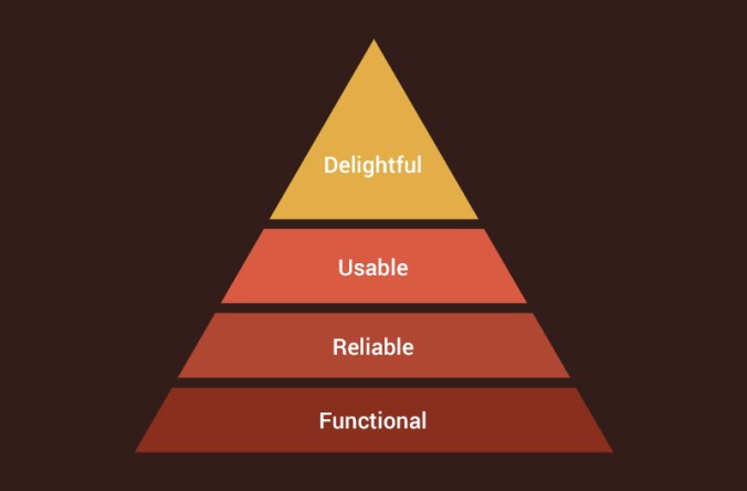
At the top of Aaron Walter’s pyramid of the user’s needs sits delight.

So what is delight in software? I like to think of delight as an unnecessary positive addition to the experience. This can be anything from a hover effect to a video or even clever text. Elements of delight do not contribute to the functionality, reliability or usability of the product; they are purely for fun. Let me show you a couple examples.

A common form of delight is what most people call Easter Eggs. These are fun, surprising features of a product. A popular example is Google’s Do a Barrel Roll. If you type ‘do a barrel roll’ into Google, the window ‘does a barrel roll’ and your screen flips around in a circle.

Delight does not always have to be as wild as doing barrel rolls. They can be as simple as a picture or drawing. Google’s 404 page is a good example. Reaching a 404 page is never fun, but Google makes it a little less painful with a cute, broken robot.

My favorite example of delight is Hipmunk’s flying chipmunk. While this site is searching for your flights, the cutest chipmunk on the internet bobs back and forth like he is flying. It’s adorable.

So why do I think these elements of delight are necessary? Because they give the user something to remember. They bring emotion to a process that is so automated. Searching for flights is terrible! I usually leave the experience feeling like I just wasted an hour staring at a screen full of high prices instead of feeling excited for my upcoming trip. Hipmunk is fantastic because it is very easy to use, reliable and functional, but without that chipmunk I probably would not use Hipmunk as much as I do. It is not often I smile when I am searching for flights, but I smile every time I see that little guy.

Elements of delight can give a company a personality. They show the user that there are not only computers behind the product, but people. People design and build everything you use, but too often a product might as well have been designed by a robot. Displaying delight in a product brings out the human in our world of monotonous data gorging.

Usability: Designing with Data

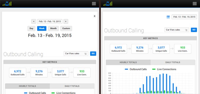
Last summer, I added a fancy date picker to the top of all of CI’s major reports. This date picker included buttons to quickly access data for a variety of date ranges. This feature enhanced the usability of our software, but we recently realized a problem – the date picker was taking up too much vertical space on the top of the page, pushing each report’s meaningful data down and out of view when the page loads. To remedy this problem, we have collapsed the date picker behind an expandable button – which bumps up the meat of the report upwards a good 150 pixels when the page loads.

date_picker

This was a quick change that was really just a solution to a longstanding (and rational) complaint from our CEO about the date picker being too big. But before making this change, I wanted to track the impact the change would have on our users, so I built an analytics script that tracked how often each button was being clicked within the date picker on a report-by-report basis.

After a week of data collection, I noticed a very curious trend. Of the thirty or so unique reports that we have across our various platforms, nearly 80% of all report views were for the Outbound Activity report. The Outbound Activity report is a useful report, but is certainly not one of our flagship reports.

Even more interesting, of the people who accessed the Outbound Activity report, 65% clicked the “Day” button on the date picker (which shows yesterday’s data), and 82% clicked the “Next Range” button.

I was at baffled by this data. Why are our users so obsessed with the Outbound Activity report? Why are they clicking the “Day” and “Next Range” buttons so often?

After a discussion with one of our consultants, the answer became blindingly obvious. The vast majority of our users use this Outbound Activity report to monitor their live outbound calling activity on a per-staff member basis, ensuring that everyone is meeting their daily OB call quotas.

Not having known this, we still had the default date range for this Outbound Activity report set to the previous week. Thus, our users were (apparently every hour or so) having to load the OB report, then click “Day” to load yesterday’s data, then click “Next Range” to load today’s data. Convoluted by the fact that the date picker was about to be collapsed behind a button, I realized that the process for accessing live outbound call data in our product was not at all easy. In fact, it really sucked.

Solving this problem was as simple as adjusting the OB Activity report’s date range to default to today’s date. The real challenge in the scenario was identifying that there was a problem in the first place, and this would never have happened had I not built an analytics script to gather data on our users’ behavior.

This experiment has undoubtedly inspired me to integrate user data collection into future design decisions. Improving usability always starts with understanding the user, and I look forward to using data collection to supplement my own intuition in my journey to get inside the minds of our users.

Functional. Reliable. Usable. Delightful.

Aarron Walter, MailChimp’s user experience design lead, has developed an insightful model for what goes in to creating great software. Clearly a reskinning of the famed Maslow’s hierarchy of needs, Walter’s pyramid (as seen below) is a representation of the four basic user needs that must be considered when building software.

pyramid

During my architectural studies at Texas A&M, we didn’t spend much time discussing pyramid construction, but I’m fairly sure that if the lower tiers are weak, the top tiers will crumble. That said, here is a quick breakdown of Walter’s model:

  1. Functional – Above all, software has to actually function. A button titled “Outbound Activity” must actually load a report that displays outbound calling data.
  2. Reliable – A user needs to know that the outbound calling data they are viewing is accurate and secure data.
  3. Usable – This data must be organized to be quickly accessible and easy to understand.
  4. Delightful – This is the key piece that Walter focuses on, and the piece that sets MailChimp apart from its competitors. Delightful software must appeal to the user on an emotional level, and produce an insightful and memorable experience.

Different members of Century Interactive’s dev team focus on different tiers of this pyramid within our products, and so I am going to kick of a short mini-series written by our different team members, focusing on how we strive to improve our functionality, reliability, usability, and delightfulness.

Here are the links to the posts for each topic: